


Green Scale
Description:
I created animation and interactions for Green Scale, a sustainability platform that helps students understand their carbon footprint. My work connected daily habits with familiar visual comparisons, then extended that learning into an interactive city built in Rive.
Starting with UI screens and animation placeholders from the design team, I contributed across the marketing website, questionnaire, results and carbon-literacy experience. The central question was: how could motion help a student understand what their carbon result actually means?
The brief: motion across the experience
Green Scale brings together a public website, a student questionnaire, footprint results and a carbon-literacy library. The website introduces the platform to institutions; the student experience connects everyday habits with their carbon impact and gives them ways to learn more.
I joined with UI screens and animation placeholders already in place. My responsibility was to connect motion to the purpose of each touchpoint: introduce the product, make questions recognizable, explain the scale of a result, and make learning interactive.
Website & login
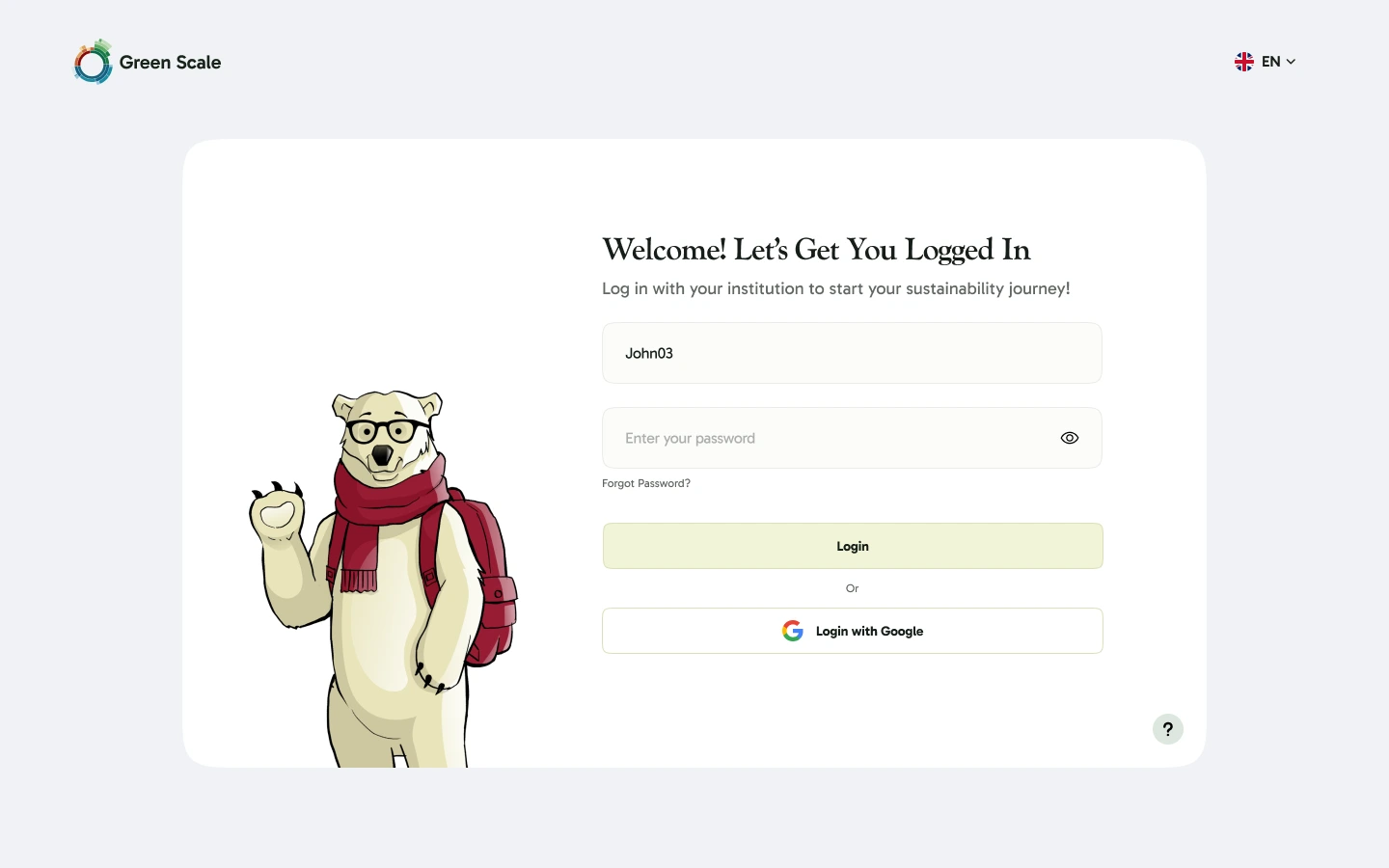
Dragonfly flight, a forming graph and the bear illustration welcome students into the product.
Questionnaire
Contextual mascot animations connect each question with a recognizable daily activity.
Results
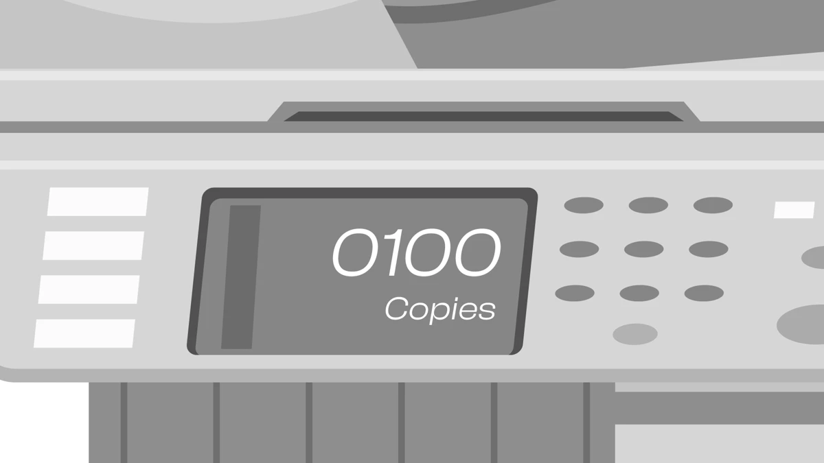
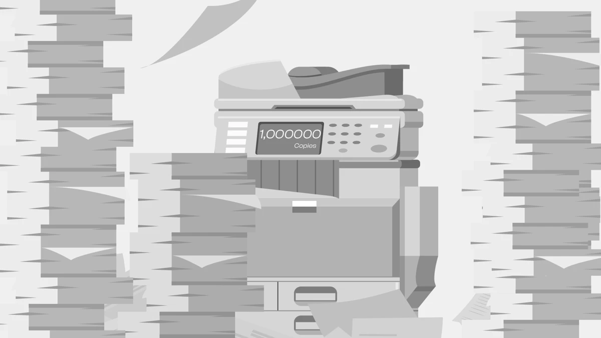
Paper, football and phone metaphors turn an abstract footprint into a familiar sense of scale.
Literacy
An interactive city supports the learning content by connecting choices with visible CO₂e feedback.
Homepage: the UI before motion
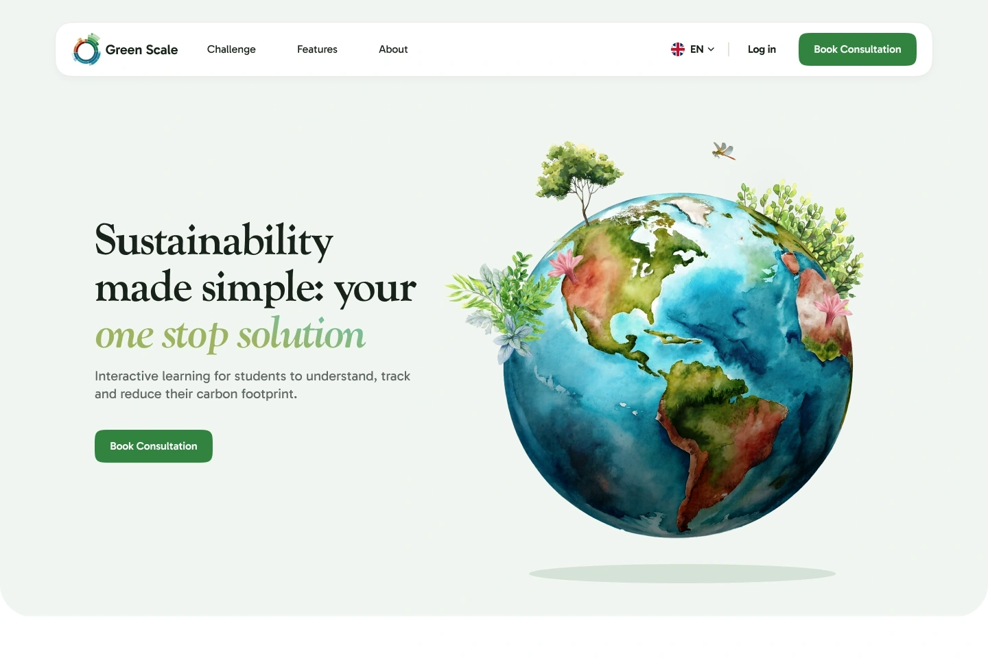
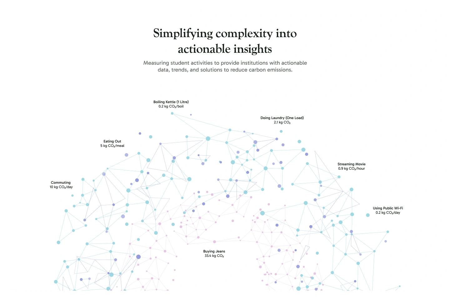
The design team’s homepage introduced both sides of Green Scale: an approachable learning experience for students and useful carbon information for institutions. These two UI sections established the context for my motion work: the hero illustration and the data visualization.
Homepage: bringing the UI to life
The dragonfly travels from left to right across the hero, bringing movement to the planet illustration. Further down, scattered dots resolve into a graph: a visual transition from individual activity to understandable information. These two sections show how each animation fits within the final UI.

Questionnaire: a cue for every question
The questionnaire asks students to reflect on everyday routines, from bathing and food to transport, devices and leisure. The wireframe already reserved space for the mascot beside the question. My task was to make that space useful throughout the flow.
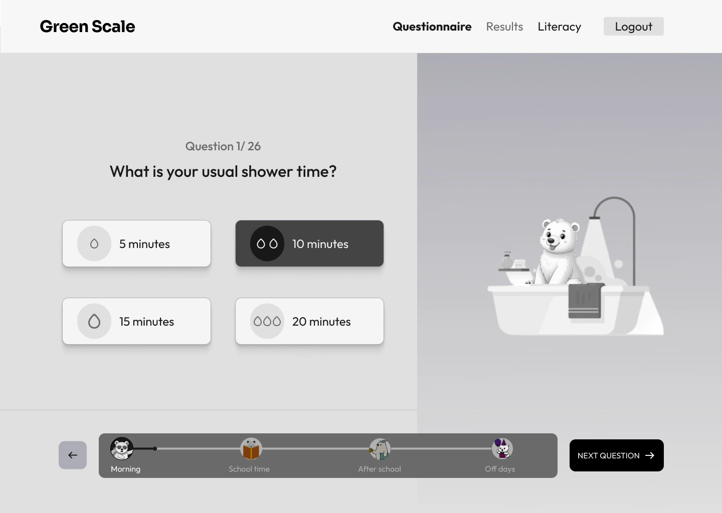
I used keyword mapping to connect each topic to an action or prop. Bathing became a shower; a food question became a serving tray; cinema became popcorn. The character gives context while the question and answers carry the detail.
The mascot animation system
The complete set covers 26 question moments. A consistent character ties the experience together, while the action changes with the topic. This lets the mascot support the question without asking students to learn a new visual language at each step.
Placing the motion in the questionnaire
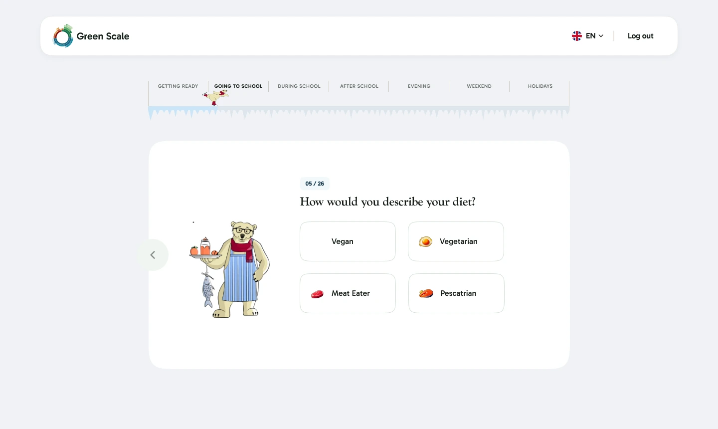
The finished UI keeps the question, progress and answer choices in focus. The contextual bear occupies the illustration area beside them. Here, the food animation sets up the subject before the student selects a diet option.
Results: making the number relatable
The results page was the strongest opportunity to move from awareness to understanding. I proposed paper, footballs and mobile phones as familiar references that students could picture alongside an otherwise abstract carbon result.
I developed the metaphors and asked the Green Scale team for the conversion data needed to support them. They supplied the values; I translated those values into visual sequences. Keeping those responsibilities connected mattered: the animation needed both a recognizable reference and a numerical basis.
Each sequence starts with something familiar and reveals a larger quantity. The change in scale becomes the explanation, giving the number a visual reference that the student can follow.
From comparison to storyboard
For the paper analogy, the storyboard breaks the explanation into visual steps: introduce the copier and sheets, build the stack, then pull back to reveal the scale. Planning the sequence made it possible to decide what the viewer should understand before the next reveal.
The animation follows that progression. A single frame can show a large quantity; motion can explain how the familiar object relates to that quantity. This was where the metaphor became an understandable sequence rather than an isolated illustration.

The finished analogies
Did the analogies make it clearer?
In a small evaluation with students from the target demographic, 6 out of 20 understood the concept before the analogies were introduced, compared with 17 out of 20 after.
That gave us an encouraging signal that familiar comparisons helped students interpret the concept. These results describe this close student group and the analogy work; they do not establish a wider learning or behavior-change outcome.
6 / 20 students
30% understood the concept17 / 20 students
85% understood the conceptLiteracy: the brief
Green Scale’s literacy content introduced carbon concepts through articles. The product team supplied the concept for a city environment that could make those ideas explorable. I built the interaction logic and state machine in Rive to turn that concept into a working experience.
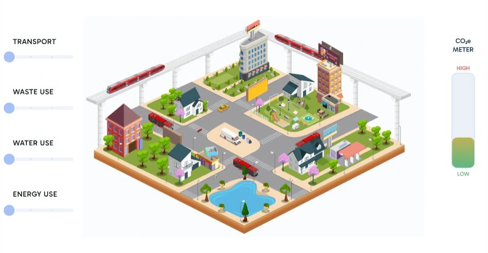
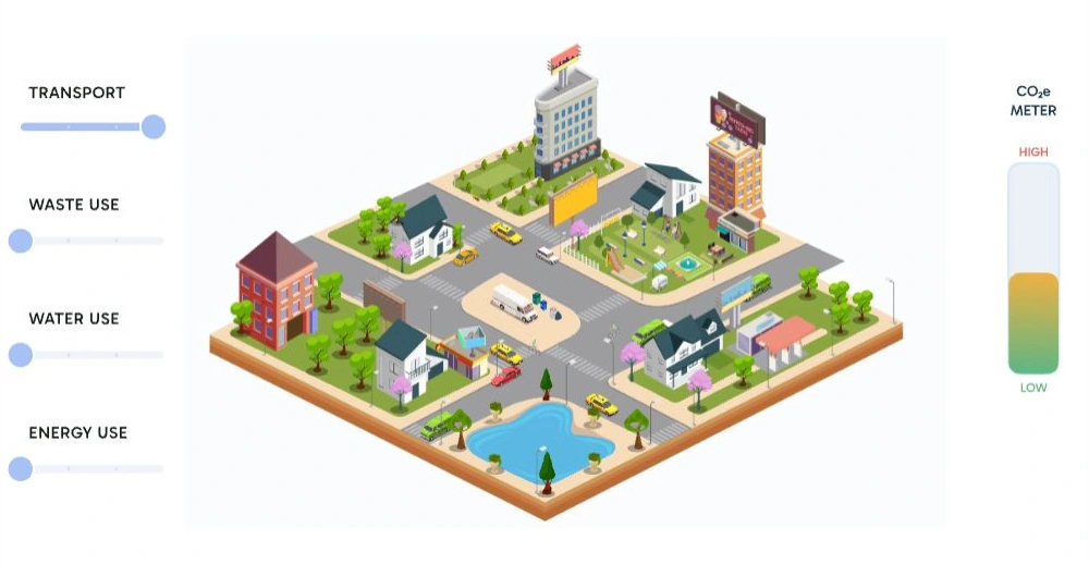
The city connects transport, waste, water and energy controls with changes in the scene and a CO₂e indicator. A student can adjust a choice and observe the response, creating a visible relationship between an action and its consequences.
The intended learning opportunity was to question assumptions about everyday systems, including transport, by exploring their effects together. The city is an educational model; its indicator is part of the supplied experience.
The product team provided the city concept. My part was to build the logic and animation behind it: organize the different responses, connect the category controls, and make the feedback work together inside Rive.
Storyboarding the interaction
Reconstructed from the finished Rive file, this sequence shows how the interaction develops: begin with a scene, change one category, then explore how several choices combine. The response needs to be visible in the environment and in the CO₂e meter, so students can connect the control they moved with what changed.
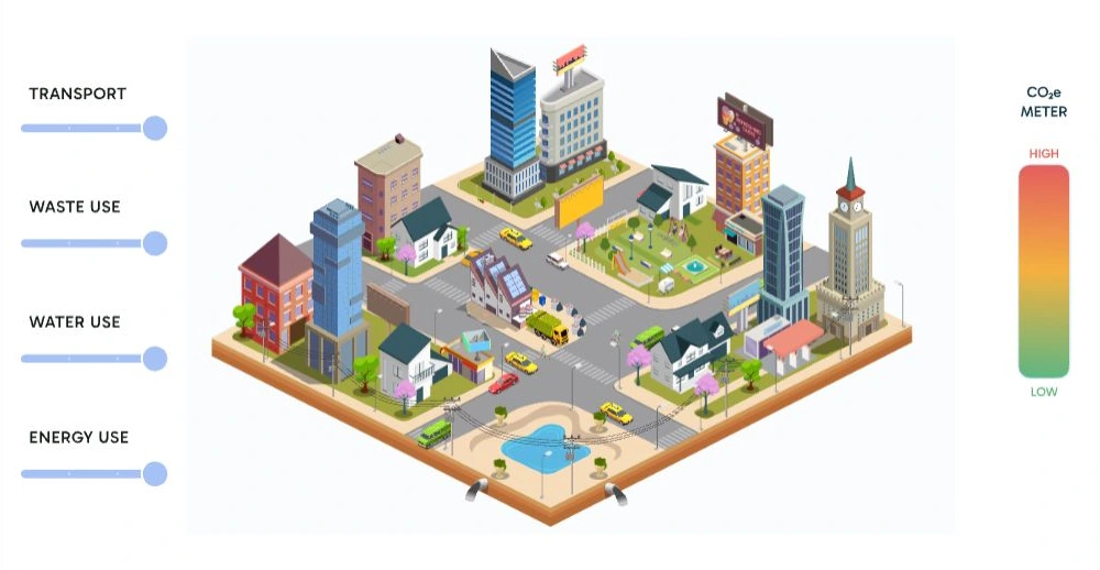
The working Rive experience
Use the four sliders to explore the city. With keyboard focus on the city, use up and down to select a control and left and right to adjust.
The interactive city loads when you start the demo.
Inside Rive: selecting a category state
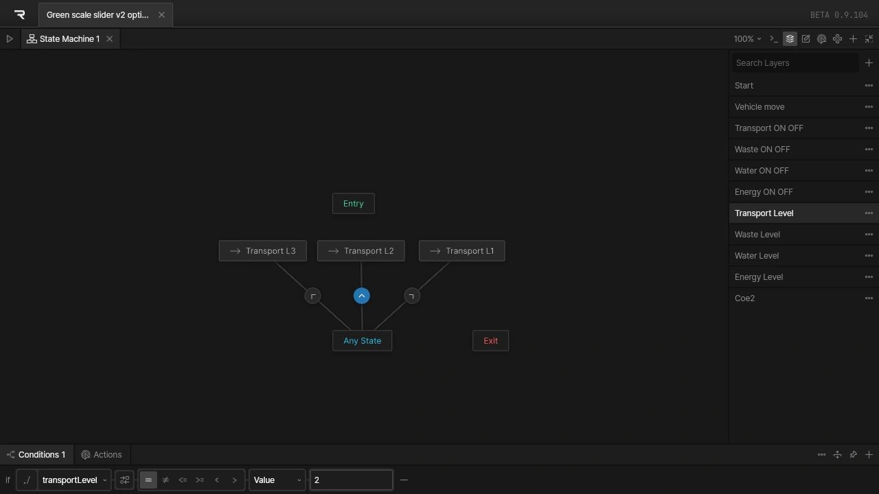
I organized the behavior into separate state-machine layers. Transport Level, Waste Level, Water Level and Energy Level each select among three animation states. Separate on/off layers sit alongside the start and vehicle-motion layers.
In the transport layer, Any State connects to Transport L1, L2 and L3. The selected transition below runs to Transport L2 when transportLevel equals 2. The category can therefore change state from wherever the interaction currently is, without requiring a separate path between every pair of levels.
Inside Rive: combining the CO₂e feedback
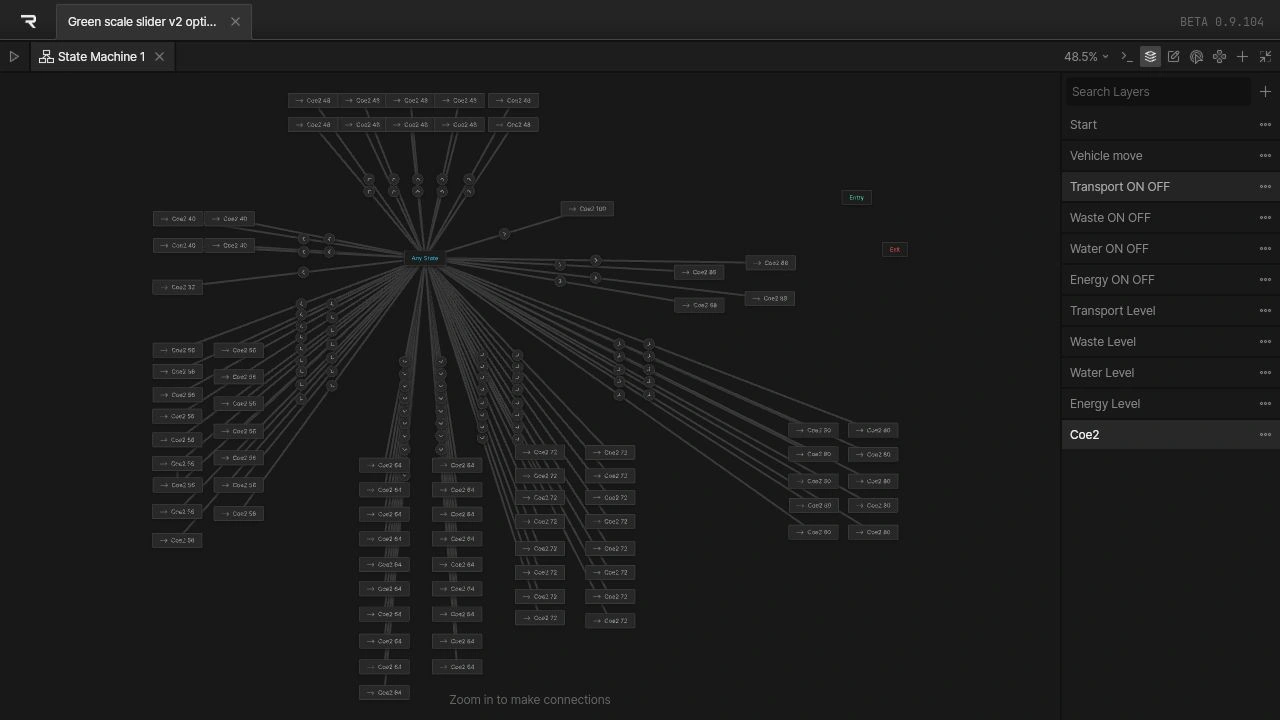
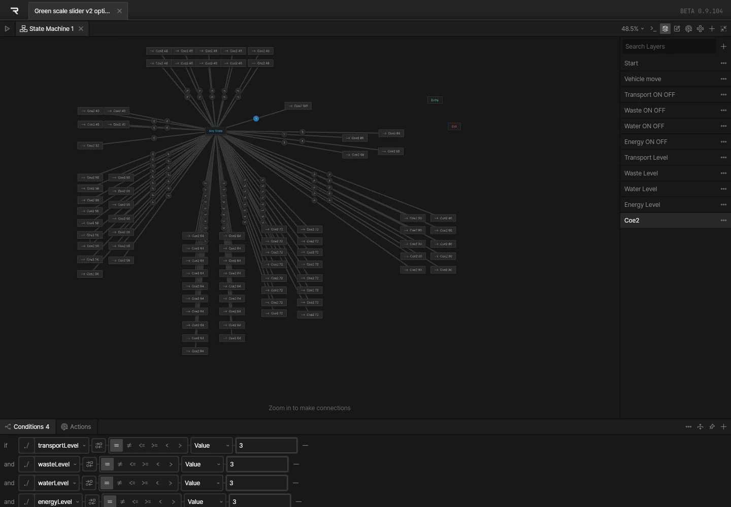
The Coe2 layer coordinates the meter with combinations of the four category values. Its graph contains repeated routes to the meter animations because different combinations can lead to the same displayed state.
For example, the selected route to Coe2 100 requires four conditions together: transportLevel = 3, wasteLevel = 3, waterLevel = 3 and energyLevel = 3. This is the logic inside the supplied file, rather than a separate calculation added for this case study.
Separating the category animations from the combined meter logic let each part of the city respond to its own control while keeping the overall feedback connected. My contribution was building those states, transitions and conditions around the product team’s concept.
What this project taught me
This project made the relationship between animation and understanding more concrete for me. The most useful motion had a clear purpose: establish context, explain scale or reveal the result of an action.
The metaphors also showed why visual ideas need a data conversation. Requesting conversion values from the Green Scale team let me develop the explanation around supplied information. The student feedback then gave us a way to assess whether that explanation was helping.
Across the questionnaire and city, I learned to think beyond a single finished animation: how the motion fits the interface, what a student needs to understand at each point, and how the interaction connects those moments.
Tools used