


Making Budgets Bloom
An interaction design case study for a weekly marketing budget slider










Your weekly
marketing budget
Estd. reach
Illustrative reach · concept demo


Choose a whole-dollar total budget from 40 to 1190 dollars for a seven-day US awareness campaign. The tooltip shows the daily average rounded to the nearest dollar; Pay shows the exact weekly total. Reach is illustrative, not a Meta forecast.
CAMPAIGN PREVIEW
Ready to grow?

Your budget is $10, with an estimated reach of 2k - 5k.
This is a demo. No payment will be taken.

Description:
A weekly marketing budget slider that connects spend, illustrative reach, and a changing flower through responsive motion.
UX motion design, visual metaphor, responsive interaction, and implementation refinement.
The opportunity
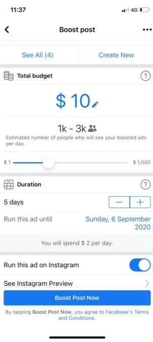
I explored how people choose a budget when boosting a social media post. In the flows I reviewed, the slider was clear and functional, but moving it mostly changed numbers. I wanted to make the decision more engaging while keeping the relationship between spend and potential reach easy to understand.
Design question: Could motion make a budget change feel meaningful rather than simply decorative?
1. Outside-in review
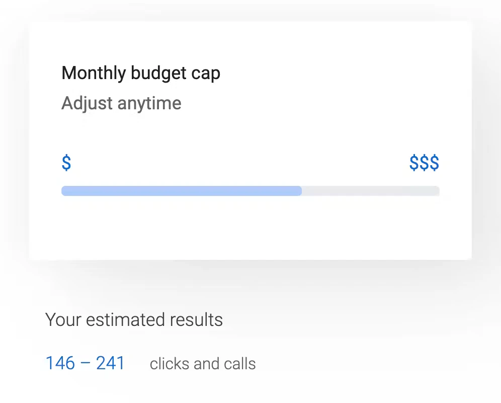
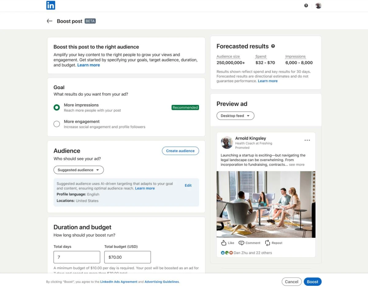
I started by reviewing Instagram’s boost-post flow, similar flows on other social platforms, and online marketing tools. These references showed me a straightforward way to set a budget, but they left room for a more expressive response to the user’s input. I treated that observation as a design opportunity, not as a claim that the existing products failed.
2. Keyword mapping and metaphor
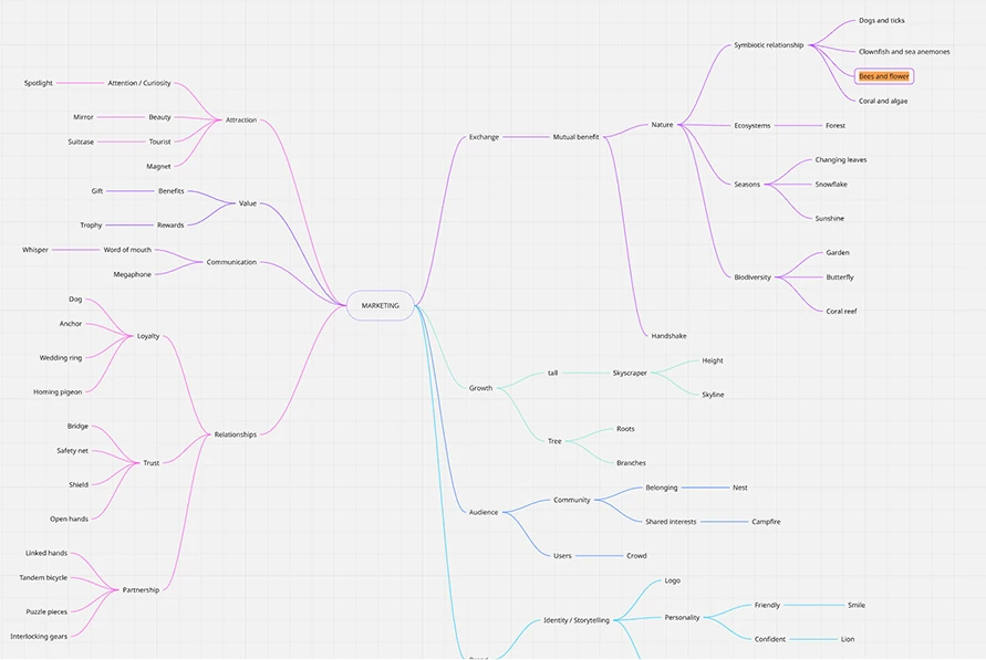
I set the overall direction, then used AI to expand the keyword map around budgets, campaign scale, reach, growth, and audiences. I selected the words and connections that felt useful rather than treating the generated list as a concept in itself. Flowers and bees emerged as the visual relationship: a larger campaign becomes a more substantial flower, while more bees suggest a larger potential audience. AI also helped me explore flower and bee references as I developed the progression. The slider could therefore change both a number and a living visual state.
The metaphor needed a clear hierarchy. At lower values, the scene is quieter. As the budget grows, the flower and bee activity become richer. These changes communicate increasing scale without requiring the user to interpret numbers alone.
3. Wireframing the interaction
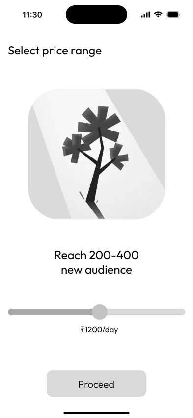
After defining the metaphor, I wireframed the experience before developing the illustrations or polished UI. I established the placement of the flower, weekly budget, slider, and estimated reach, then used AI feedback to challenge and refine basic layout decisions. The wireframes helped me check where attention should move during a gesture, and whether the visual story supported the task instead of overpowering it.
4. Concepting and illustration system
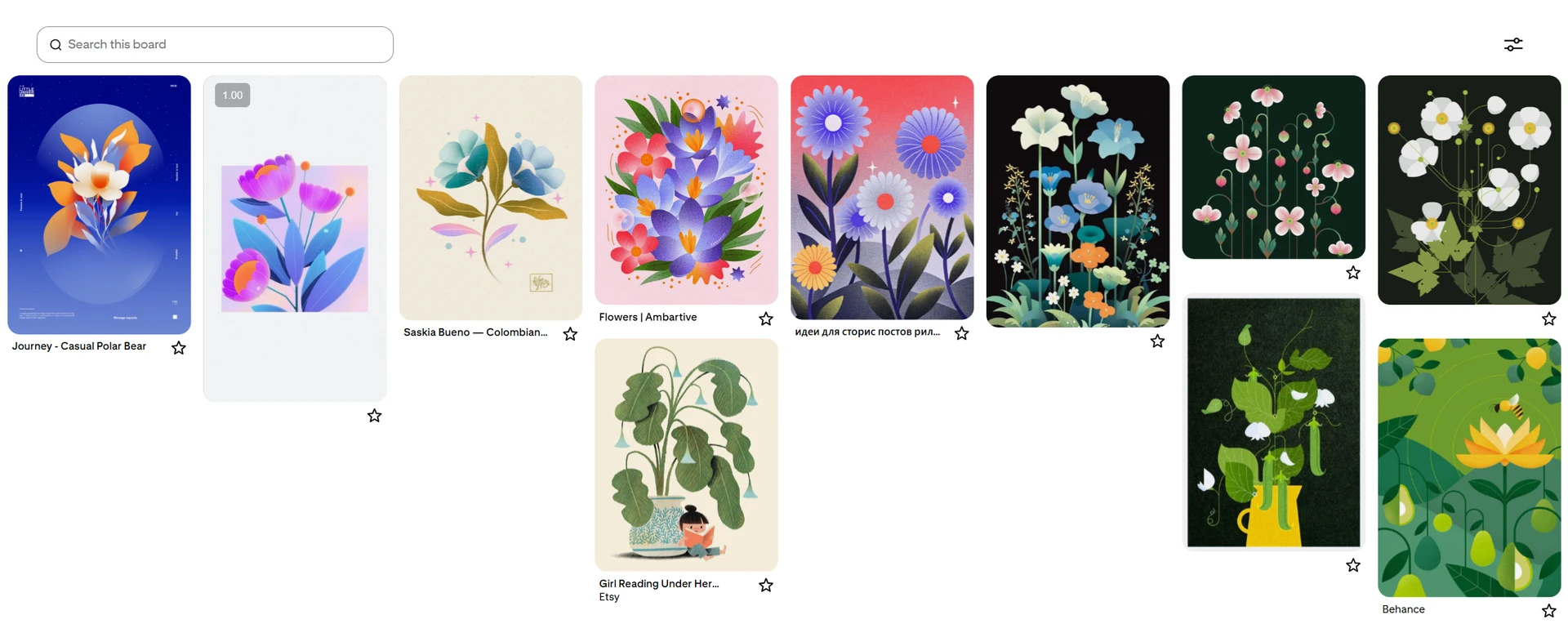
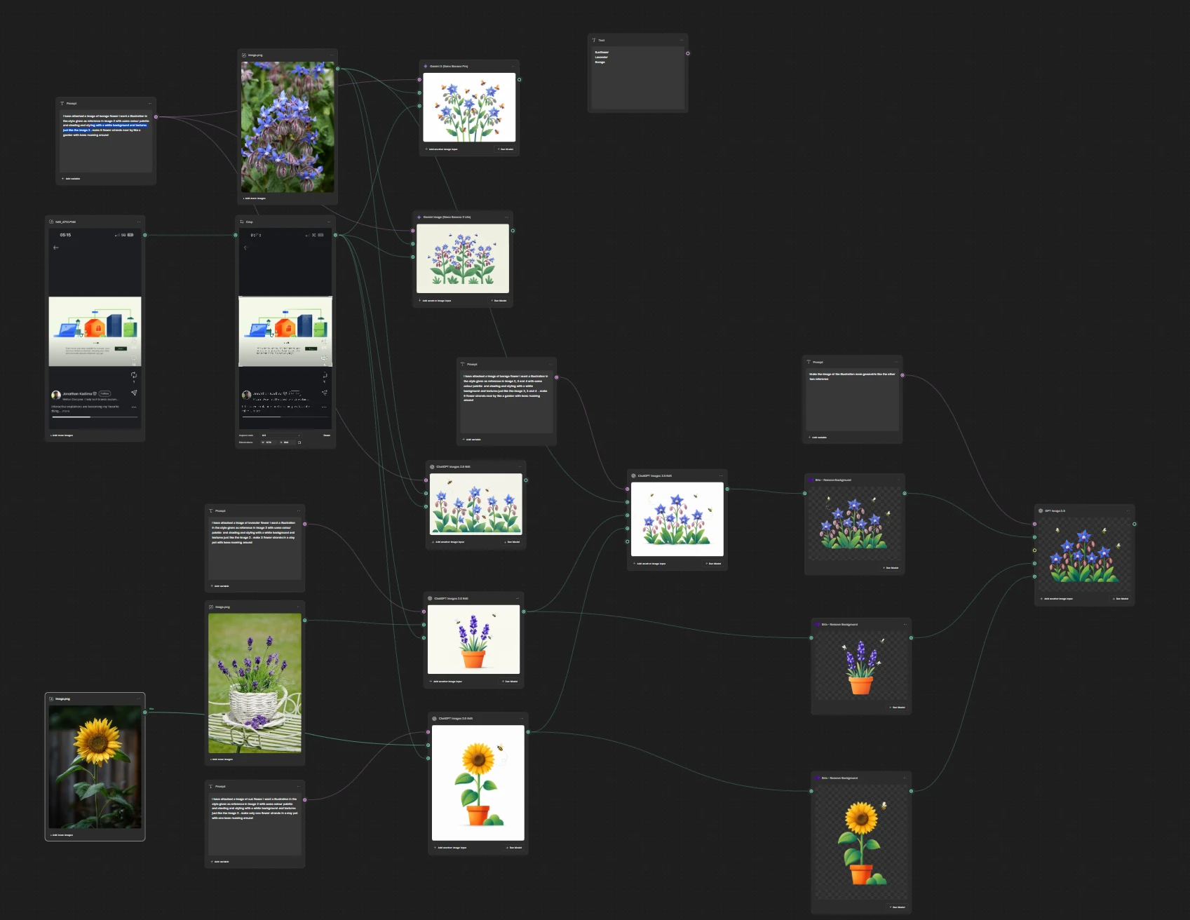
I gathered flower and illustration references on Pinterest, paying attention to shape, edge quality, and overall mood. I used that mood board to guide concepts made with Figma Weave and multiple AI image tools. I compared flower forms and bee activity against the hierarchy I wanted to express, then selected a direction to turn into editable vector artwork.
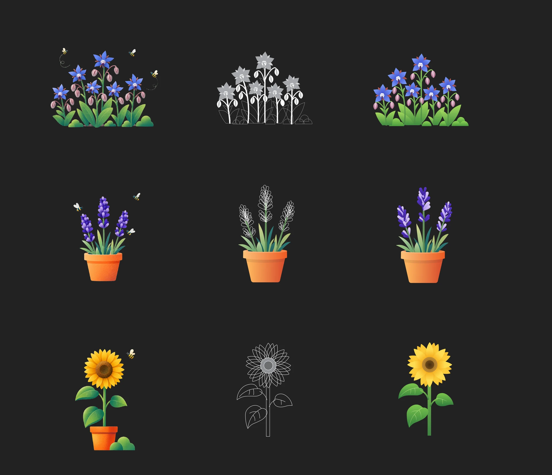
I drew the sunflower as an editable SVG, defining its parts and path structure myself. Direct AI-generated vectors had produced too many unnecessary points to manage well, so I gave the sunflower to AI as a concrete reference for the lavender and borage. Through Figma’s MCP connection, it extended the system to those two flowers. I reviewed and corrected the results, matched their colours to the concept art, and enforced a consistent illustration rule: two-colour linear gradients, without additional colour stops. My role was to set the visual direction, build the reference example, and quality-check the system rather than accept generated output as finished artwork.
5. Motion and state machine in Rive
I brought the vector illustrations into Rive to animate the flowers and make them responsive to the slider. I first established the sunflower’s motion as a reference, keeping its idle loop separate from the entry and exit timelines. That separation let the flower continue to feel alive while present and gave transitions a distinct beginning and end. I then used AI assistance through MCP to extend the motion language to lavender and borage, reviewing and correcting transitions that did not match the intended feel. I also used AI to help build the Rive state machine connecting slider input to flower states and coordinating those different timeline roles. The working pattern was to demonstrate the rule, delegate the repeated applications, and judge the results.
Fast slider movement revealed a problem. If every value immediately triggered a flower state, the animation played through intermediate flowers that the user had not settled on. That made the response feel busy and gimmicky. I introduced a brief settling delay so the flower reacts to the intended value after the gesture pauses, while still feeling connected to the input.
6. Interface design and working prototype
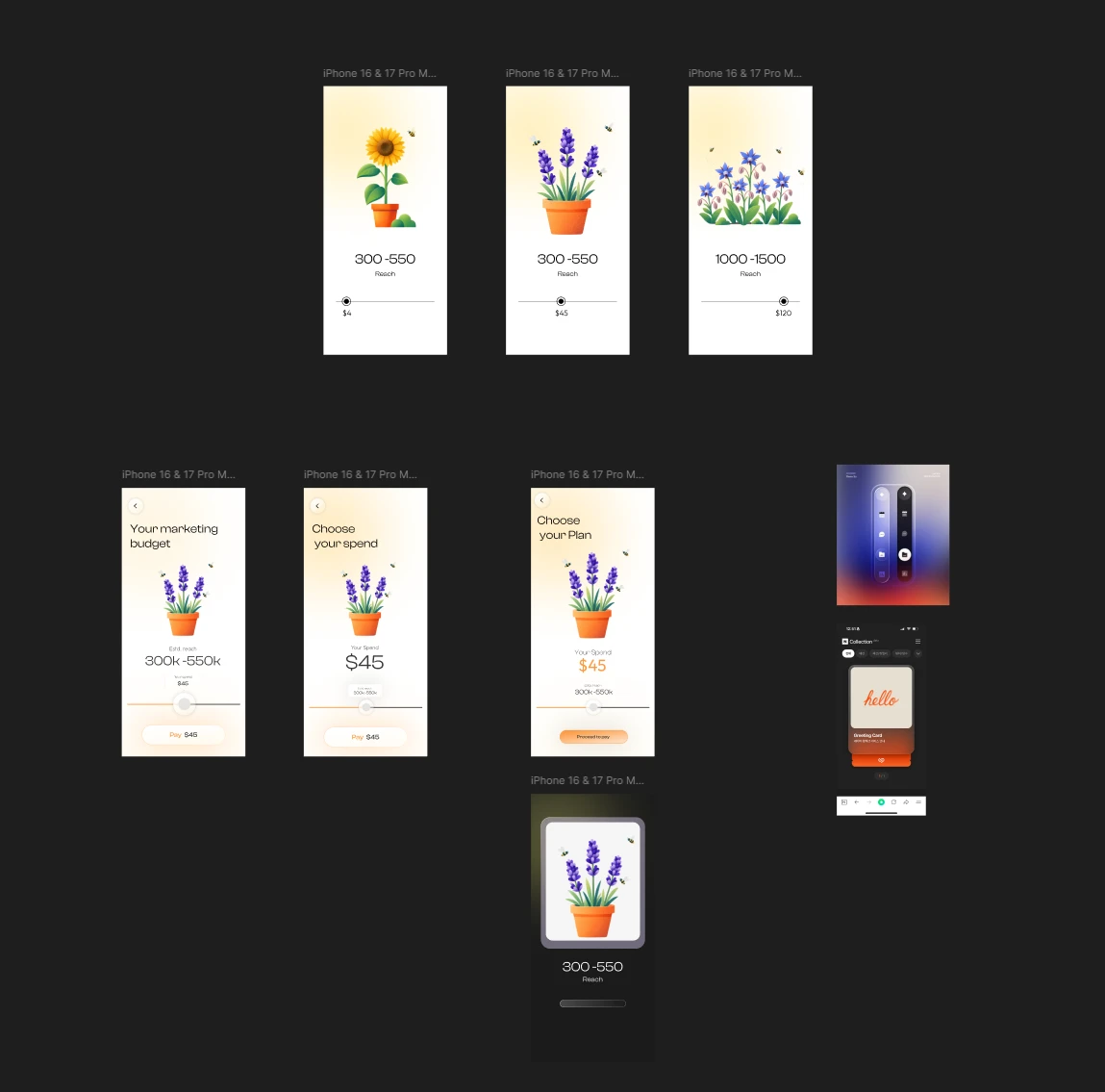
Once the metaphor and motion were established, I gathered UI mood references and explored blur and gradient treatments with AI. I made the final interface design in Figma: a minimal layout with subtle blur, gradients, and glass-like surfaces so the flower remained the focal point. I then used AI assistance to translate my Figma design into working HTML and connect the Rive interaction. This remained a back-and-forth process: I made a design decision or reference, AI applied it to the build, and I reviewed the result in the live interaction.
7. Refining the interaction
The finishing work focused on how the prototype behaved under real gestures and across phone sizes. I adjusted the slider’s usable boundaries on mobile so its thumb and value stayed comfortable at either end. I refined the estimated-reach counter so the digits roll vertically without causing the text to wobble horizontally or clip. I tuned the relationship between immediate budget feedback, reach movement, and the slightly delayed flower response. I also checked the layout across different screen heights to preserve the intended visual hierarchy.
These were motion design decisions as much as implementation fixes. Timing, continuity, and spatial stability determined whether the metaphor clarified the interaction or merely added activity.
Outcome and reflection
The result is a responsive, working interaction in which the weekly budget, estimated reach, and flower form one feedback system. The project demonstrates how motion can communicate changing state, guide attention, and add delight to a functional control.
The reach figures in this concept are illustrative and should not be presented as measured campaign performance. I estimate that this project could have taken about a week without AI assistance; this workflow brought it to a working result in roughly two days. That is my retrospective estimate, not a tracked productivity measurement. The strongest outcome is the interaction itself and the refinement behind it: moving from an expressive idea to motion that remains understandable during fast gestures and on different screens.
Tools used